Translate

Nov 28, 2014

About framing: Just like an actual frame, there are also more sides to one story.

Follow my blog with Bloglovin

Golden frame


See the picture above of the frame? As you are looking it now, you can see the nice golden borders. You are looking at the ‘pretty’ side of the frame. The side that is used the most and that you would find in most households that actually have this frame. You probably put a nice picture in it of your family, friends, a beautiful landscape or whatever you like. But this is not the only way to display the picture. You can also turn it around and have the pretty side face the wall. Now you would see the back of the frame. Maybe to some it would be less attractive, but it is still a possibility. Does this change the picture or the frame? No, it doesn’t. It merely shows another side of it. It changes your perspective on the frame, but it doesn’t change the frame itself. This change of perspective I just described is called framing.
As Robert Entman describes it (on page 52): “Framing essentially involves selection and salience. To frame is to select some aspects of a perceived reality and make them more salient in a communicating text, in such a way as to promote a particular problem definition, causal interpretation, moral evaluation, and/or treatment recommendation for the item described”. When they are ‘creating news’, journalists also make judgments about framing. They decide how they make news events more comprehensible for their audience.
According to James Druckman the public opinion is influenced by the frames elites choose to use. He states that the elite can, for example, influence whether the public sees a certain event as a free speech issue or a public safety issue. It is important to note that the word ‘influence’ is key here. As Craig Watkins said, frames do not determine what people think.  According to Entman the effect of framing doesn’t merely stem from what they include, but also what they exclude. Or in other words, it is not just about what you say but also what you do not say. It is, however, the question if it is good or bad that some pieces of information are included and some are excluded.
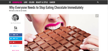
To show you an example of framing, take a look at these articles. If you just look at the title alone of the article by the Guardian and the article by Cosmopolitan, you can see the way they have framed the news that the chocolate production might come to end. Of course, this example is a little extreme and the Cosmopolitan is not an actual news organization, but it does show you how different writers can portray the same story in different ways. As you can see, the Cosmopolitan (jokingly) describes this news as devastating and recommends everyone to stop eat chocolate now before it is too late. The Guardian takes a more neutral approach and also describes the facts later in the article.
Example of framing - Guardian article - the future of chocolate, why cocoa production is at risk


Source                                                                                            
Cosmopolitan article - Why everyone needs to stop eating chocolate
 Source

When you look at these articles, do you think framing is good or bad? Does it matter to you that the same situation is portrayed differently in this case?
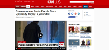
Now, look at these three examples about the shooting on the university campus in Florida. If you take a closer look at all three articles, you can see more differences. But the following differences are the most noticeable.
If you just look at the titles of the articles, you can already see differences. News organization CNN and the magazine TIME focus on the wounded students, while the non-profit news organization NPR focuses on the gunman who has been shot dead by the police.
Example of framing - CNN article: Gunman opens fire in Florida State University


Source                                                                                
Example of framing - TIME magazine article: At least three wounded in shooting at Florida State University
Source
Example of framing - NPR article: Florida State University gunman shot dead by campus police


Not only differences in the titles are noticeable, but also what they author has focused on. The CNN article, for instance, reports a quote by a student about the shooting: “As Kalich said, “Yes, the students (who) were in the library were affected. But 40,000 students lost their sense of security”.” As you can see by quoting this perspective, the CNN focuses more on the students and not just the students that were at the campus during the shooting.
The article by the Time quoted another student: ““This is always stuff you hear about happening at other schools like there are other crazed gunman at colleges but not at Florida State,” student Blair Stokes, who was in the library during the incident, told CNN. “I think this is another issue about gun control and about how we can be doing more in America”.” Do you see the difference? By reporting this quote the Time has shown that this was not the first shooting in a university in America and has implicated in this way that a stricter gun control is necessary.
Yet another student was quoted by NPR: “Allison Kope, a freshman from Cocoa Beach, Fla., said she was on the library’s first floor when she heard a loud noise. People began screaming about a gunman, she told the AP. “You never think something like this is going to happen to you until you have to react in that situation when someone is screaming there is a gun in the building. I ran for my life,” she told the agency. “I ran right out the back door. My laptop and everything is still in there. It was shock. It was just instinct. You don’t think about anything else, you just go”.” As you can tell by this quote, the NPR focuses more on the shooting itself and what happened during the shooting.
When you look at these articles, has your opinion about framing changed? Do you think framing is good or bad now?
In my opinion whether framing is a positive of negative thing depends on the topic you’re dealing with. In the case of the first examples about the chocolate production coming to end, I don’t think it is necessarily bad or good to frame the story. I think you can portray it anyway you want it. However, when the topic you’re dealing with is more serious, I would strongly recommend you to be more careful about how you portray the event. Matters like the school shooting in Florida, are far more serious and are carefully read. As a journalist, you need to look at it that way as well. Try to be objective and not only show your view on the matter. And yes, it is almost impossible to be complete objective as a journalist. You always put your own vision or perspective on a matter into your story, whether it is intentional or not. So what should you do? How can you still be as objective as you can? First of all, try to get all the facts. Even if you yourself don’t agree with some view, make sure you still get the information. It is your job as a journalist to gather information, so the public can form their own opinion. That also brings me to the second thing; try to show more sides to the story. Look at the event from different perspectives. And lastly, do not assume anything. Be critical and look for the most accurate, trustworthy information.

Nov 24, 2014

The power of good visualizations

Follow my blog with Bloglovin

The power of good visualizations that's the topic of this week. Why are visualizations powerful? How can I make my visualization powerful? Those questions and other will be answered in this blog pot.

Last week I already talked about how to find data and the importance of a good dataset. This week I’m going to talk about how you can make that dataset come to live. Visualizations are a great way to make your story more comprehensible and to make it easier for readers to extract meaning from your dataset.
Why should you use visualizations?
As Alberto Cairo, professor of the professional practice at the School of Communication of the University of Miami, author of the book ‘The functional art: An introduction to information graphics and visualization and an instructor of the free online data driven journalism course, describes a visualization is a graphical representation of evidence. He explains that we use graphs and maps because in many cases they are the only way in which we are able to extract meaning. A spreadsheet is just a set of numbers, where you can only see the actual figures. But if you transform that set of numbers into a graph or visual, our brain can extract meaning and patterns from that data. To show you how powerful visualizations can be, Cairo used this map as an example:

ukrainemap
Source

This map represents the elections in Ukraine. The different colors on the map represent what political party got more votes in the parliamentary elections in 2012. The blue circles represent where the Party of Regions, the party of the current president, has won. The orange circles represent where the Fatherland Party, the opposition party that is pro-Western, has won. The size of the circles represents the difference in votes in favor of the party that won in a particular district. Even if you don’t speak Ukrainian, you are able to extract the main meaning of this map. You can see that Ukraine is divided. You see that the Western part of the country votes more for the opposition party and the Eastern part votes more for the party of the current president. When you just look at a dataset, you would not be able to see this pattern. Thus, you would not have been able to extract the meaning of the data. And that is exactly why visualizations are so powerful.
Importance of good visualizations and things to avoid
Now that you know visualization are powerful and can make your story more comprehensible, it is important to be critical as to what visualizations you use. Your visualization should be clear, concise, not too complicated and should help your readers see the differences you want to show. When you use a good visualization, it can be a great addition to your story. It helps bring your story to life and it makes it clear what you are talking about. When you use a visualization in the right way, it can also make your story more interesting. However, if you use a visualization the wrong way, it can affect your readers’ interest in your story and your credibility as a writer. Bad visualizations might help you attract readers, but it is not smart to use them. If your readers find out that your display of the data is incorrect, they will distrust everything you say in your story and might not even be interested to read further. Mistakes can happen. So if you accidentally use a bad visualization only once, it probably won’t matter as much. However, if you start using them more often, it will affect your credibility. But what makes a visualization bad? And what should you thus avoid? To answer this question, I will show you some examples of bad visualizations and how to use them in a better way.
This first example below of the bad visualization is quite obvious. As you can see, the height of the bars in the first visualization doesn't match the numbers that are displayed. Instead of using this bad graph, you should be using the second graph. You can see that in this revised graph the numbers match the height of the bars.


Source    
cnngraph


In the second example you can see that in the first graph, the numbers on the vertical axis don’t start at zero. There are indeed some differences between those zeven months but the differences are not as big as they seem in this graph. If the y-axis would have started at zero, you would have been able to see that more clearly. Instead of using the first graph, you should use the second graph where you can see the actual differences. However, it should be noted that it is not always bad to start the vertical axis somewhere above zero. You may have noticed that the vertical axis in the first example doesn’t start at zero either. However, in that case the differences in heights of the bars represent a large difference in the amount of money that the government has spent. If the axis would have started at zero, you would have believed the differences weren’t as big. So keep in mind what your graph is representing and what is the most adequate way of displaying your data.

y0as


Source  


In the last example below you can see that the visualization on the left provides you with a lot of information. The first map in the first visualization shows you the unemployment rate in the Netherlands from the January 2008 until January 2013. The second map shows you the rate from January 2012 until January 2013. This visualization is supposed to show you how the unemployment rate has changed over the last five years in comparison to the last full year. However, in this display of the data it is very hard to extract the real meaning of this map. It is difficult to see the differences between those two maps. Instead of trying to display all this data at once, you should use a map that is more concise. In this case, it would be better if you just showed the second map, like shown in the second visualization. If you still would like to show the development over the past five years, it would be wiser to use a different kind of visualization.
nederlandkaartkleuren
mapnederlandaangepast


Source

What are the key elements to a good visualization?
So what makes a visualization good? Cairo states that there are  four features that define a good visualization. Your visualization should be functional, beautiful, insightful and enlightening. The shape of the graphic should match the questions that the visualization answers. The visualizations should also be attractive and insightful, so that readers will be eager to read your story. Besides that, the information displayed in the visualization should also shape the perception of the reader. According to Cairo, the three rules that you need to keep in mind in order to portray these features are as follows:
  1. Think about your audience and the publication.
  2. Think about the questions your visualization should answer
  3. You should be able to understand the visual without reading every number
In my opinion and as you have seen in the examples above, there are some other important and more concrete factors to pay attention to. You need to make sure that the numbers you show match with what you display in your graph. Moreover, pay attention to the y-axis and the x-axis and try to keep your visualization clear and concise. Don’t try to display too much information at once. And also, keep in mind what you want your visualization to represent. Like Cairo stated, it is important to think about the questions your visualization answers. That can mean that in some cases it is more logical to break a few rules in order to display your data in a more adequate way.
Conclusion
Visualizations can be a powerful and quiet useful addition to your story, provided that your visualization is correctly used. You have read above why it is important to use good visualizations. Furthermore, the examples above and the rules of Cairo have shown you what you need to think about before you create or use a certain visualization. Think about what you want to show and what message you are trying to deliver. And like always, be critical!

Nov 20, 2014

How to find the data you’re looking for

Follow my blog with Bloglovin

One particular field of journalism is data journalism. Simon Rogers, Data Editor at Twitter, former editor of the Guardian’s award-winning Datablog and an instructor of the free online data driven journalism course, describes data journalism as a way of telling stories by using numbers. It brings stories that are in the public eye to life by showing the numbers behind the news. The data can be accompanied by visualizations, but they are only there in service of the story.
For as long as journalism has existed, the reporting of data has played a role as well. In the olden days data was often collected by using a notebook and a cassette recorder and journalists often had to rely solely on the research and analysis performed by statisticians. Over the years the techniques of data journalism have changed. Journalists have had much easier access to tools that help them gather data, such as Excel and Numbers, and easier access to tools that help visualize their data. In the digital age we now live in there has also been a wider spread of open data. Governments and other organizations that collect statistics around the world are publishing thousands of databases online, which has made it both easier and harder at the same time for journalists to find the data they are looking for. The search for data has become easier, because journalists can now browse through the Internet and search for the information they need. However, since so many datasets are now available to journalists and the public in general, it is also more difficult the find the ‘perfect’ dataset. What I mean by the ‘perfect’ dataset is a dataset that not only offers you the data you’re looking for to accompany your story, but that is also valid. This blog post will offer you, as journalists, guidelines on how to find this ‘perfect’ dataset yourselves.
Source

How can you get data to support your story?
Quote: “Data journalism begins in one of two ways: either you have a question that needs data, or a dataset that needs questioning. Whichever it is, the compilation of data is what defines it as an act of data journalism”. – Paul Bradshaw
Paul Bradshaw is the Head of the Online Journalism MA at Birmingham City University, Visiting Professor at City University’s School of Journalism in London and also an instructor for the online data journalism course. His quote shows that a story can be either based on a question for which you need to search data or on a dataset which raises an interesting question that needs to be sorted out. This blog post will be focused on the first situation. You have a certain topic in mind and are looking for data to accompany your story. The first thing to do is ask yourself ‘What kind of data am I looking for?’. When you know what you are looking for, you can start searching for the data.
Where can you find data?
Of course you can collect your data by doing your own research, but in most cases you will probably not have the time or money to do that. Therefore, a quicker way to gather data would be to look for it online. As I have mentioned before, more organizations are publishing their data online. You can, for instance, go to a government website or the website of a national statistical service and find all sorts of data there. On this Wikipedia page you can find a list of national and international statistical services you could use to gather data. You can also look for information on the websites of international bodies, e.g. the website of the World Health Organization, the United Nations, the World Bank or the European Union.

How do you know if your dataset is valid?
When you have found a dataset, you need to make sure that the data is valid and does indeed support your story. So how do you know if your data is trustworthy? Rogers states that when you are relying on data that is collected by someone else, you need to check who collected it and when and how it was collected. Get in touch with the person who collected the data and ask them about it. Besides that, also try to find another source that has the same kind of data and compare that dataset with the one you found. These two steps are very important to determine whether your data is valid or not. Take for instance this example as described by TechTarget, that shows how the analysis of big data projects can go wrong. In this project researchers wanted to use Twitter feeds and other social media to predict the unemployment rate in the United States. They looked for words that pertained to unemployment, e.g. jobs, unemployment and classifieds, in tweets and posts on other social media. After that they looked for correlations between the number of words per month in this category and the unemployment rate of that month. During the project there was a sudden increase in the word count, so the researchers believed they were on to something. However, what they failed to notice was that Steve Jobs died in that same period they found an increase. Therefore, the number of tweets with ‘jobs’ in them were of course higher but not related to unemployment. If the researchers had looked more closely at what was happening during the time of their research, they would have known that the increase in words was unrelated to the unemployment rate. So it is important for you, as a journalist, to be aware that not all research is accurate and trustworthy. If you look for another dataset that says the same thing, the chances that you found a good, trustworthy dataset are higher. Furthermore, you need to be aware of how you interpret the data. Most mistakes about false data analysis are made by interpreting the data wrong. Look carefully at what the data is actually saying and not just at what you want or believe it is saying.
The five W's: who, what, where, when and why
Source

 Keep the five W’s in mind
The most important things to remember when you are trying to see if your dataset is valid are the five W’s, as described by Simon Rogers. Ask yourself these questions before you use the dataset you found.
  • Who: Where did the data come from?
  • What: What are you trying to say with your data?
  • When: How old is your data?
  • Where: Which situation is described by the collected data? An essential part of data journalism is to combine different datasets and create a new story. Simon Rogers has, for instance, combined the gun ownership and homicides over the world and made one supporting visual out of it.
  • Why: Why is the data you found interesting and what does the data mean?
Conclusion
In conclusion, the ‘perfect’ dataset will offer you the data you are looking for, that can accompany your story and that is also valid. This blog post has showed you how to find this dataset and how to determine if that dataset is valid. To summarize, you need to check who collected the data you found and when and how it was collected. Get in touch with that person and ask them questions about their data. When you found a dataset that could support your story, be aware that not all data is accurate and trustworthy. Try to look for another source with the same kind of data. The chances that your dataset is trustworthy are higher when you have another source that says the same thing. If you want your data to be valid, always keep the five W’s in mind. The five W’s offer you guidelines that can help determine whether the data can be trusted or not.

Nov 11, 2014

You cannot trust the internet, but you can trust news websites. Can you not?

Follow my blog with Bloglovin

In this day and age the internet plays a very large role in our lives. Vacation pictures are going on Facebook and Instagram, our funny conversations with friends are Tweeted and Retweeted and songs we or our children sing are recorded and uploaded to YouTube. Most of us are glued to our phone and computer and rely on the internet for all sorts of things. Not just recreational and fun things, but we rely on the internet as a source of news and information as well. And that is exactly where it gets problematic.
Imagine that you are scrolling through your favourite news website to see if there is anything new happening in the world. You see a catchy headline, click on the story and start to read. The story sounds plausible and has a picture with proof that the described situation happened. So the story must be true, right? Why else would a news website give this story any attention? Well, think again. Of course a news website is dedicated to real news and real events and not fake stories, but even people who write for news website might get caught in this web of internet lies. Take for example, the story that has been circulating about a tourist who came back from a vacation in Bali and found out that there was a spider living in his body. This story has circulated on social media, but has also been posted on various news website all around the world. Websites like the Australian NT News, the Dutch Algemeen Dagblad, and the Irish Daily Mirror to name a few have published this story. It was later stated by various experts that spiders are not naturally inclined to show this kind of behavior and that, therefore, the story was fake.

Verification steps

Even journalists might find it difficult to verify certain stories. Unless you witnessed something in person, it is not easy to determine whether or not a certain situation has actually happened. So how do you know what event is real and what event is not? A sufficient, concrete answer to this question is not easily found. According to Claire Wardle there is not any technology that can verify a specific user-generated content (such as the Twitter picture of the man with the spider in his body) with a 100 percent certainty. However, there are a few guidelines that can help you predict whether a story might be true or not. Wardle describes the following steps that can help you determine how plausible a story is and that can help you as a journalist decide whether or not to publish a certain story. There are more verification methods that you can use, but this blog post will focus on the four main factors. If you are interested in other verification methods or more detailed descriptions, you can look at the Verification handbook.
Step 1 & 2: Look at the provenance and the source
When a certain story has been shared on social media and other websites multiple times, it becomes difficult to determine who the original source is. The first thing to do is to browse though all the links and go back to the first time the story has been published. When you find the website or the profile of the person who has brought the story into the world, there are a few things you need to pay attention to. Look at previous articles or status updates, the people in the friend list or the followers and the pictures and videos that have been shared. Do you notice anything striking about these things? Have they been talking about serious matters or more about fun and playful matters? Use your common sense here. If something already seems a bit off at this point, it probably is. However, if you want to be sure, there are a few tools you can use to verify the information you have gathered during your search. Reverse image search tools such as Google Images or TinEye can, for example, help you check whether a picture has been published online before. Another way to check a story is to simple get in touch with the original publisher and ask him or her questions about the content.
Step 3: Look at the dateWhen looking at pictures or videos it is not only important to see if the picture or video has been posted online before, but also if what date it is taken. The date can reveal if it could be taken during the event that is shown. You can also verify the date by checking the weather of that specific date. Let’s for example say that the picture you have found was taken on the 1th of November 2014 in the Netherlands. In the picture you found you can see that it was a very dark, rainy day, which sounds plausible if you think that November is indeed an autumn month. However, if you go to Google and you look at the weather that day, you can see that it was actually a pretty hot and sunny day. Thus, the picture you have found probably is not taken on that exact date.
Step 4: Look at the location
Besides the date, the location is also an important factor. You can verify the location by searching it on Google Street View. If there are key elements missing from the Google Street View picture that are shown in the picture itself, it probably is not a real, untouched picture.

Conclusion

To answer the question proposed in the title of this blog post, you probably  can trust news websites most of the time since their main goal is indeed to provide you information about real events and not to share fake stories. However, the same lesson, namely ‘do not trust everything you see on the internet’, that applies to the internet in general also applies to news websites. You cannot trust everything that is reported on news websites either. Use your common sense when you look at news websites as a source of information. And when you are still in doubt, make use of the tools that are available to you to verify the information. The most important thing to remember is that when something sounds off, it probably is even when it is published on a website with the intention of sharing only real news.