The power of good visualizations that's the topic of this week. Why are visualizations powerful? How can I make my visualization powerful? Those questions and other will be answered in this blog pot.
Last week I already talked about how to find data and the importance of a good dataset. This week I’m going to talk about how you can make that dataset come to live. Visualizations are a great way to make your story more comprehensible and to make it easier for readers to extract meaning from your dataset.
Why should you use visualizations?
As Alberto Cairo, professor of the professional practice at the School of Communication of the University of Miami, author of the book ‘The functional art: An introduction to information graphics and visualization and an instructor of the free online data driven journalism course, describes a visualization is a graphical representation of evidence. He explains that we use graphs and maps because in many cases they are the only way in which we are able to extract meaning. A spreadsheet is just a set of numbers, where you can only see the actual figures. But if you transform that set of numbers into a graph or visual, our brain can extract meaning and patterns from that data. To show you how powerful visualizations can be, Cairo used this map as an example:

Source
This map represents the elections in Ukraine. The different colors on the map represent what political party got more votes in the parliamentary elections in 2012. The blue circles represent where the Party of Regions, the party of the current president, has won. The orange circles represent where the Fatherland Party, the opposition party that is pro-Western, has won. The size of the circles represents the difference in votes in favor of the party that won in a particular district. Even if you don’t speak Ukrainian, you are able to extract the main meaning of this map. You can see that Ukraine is divided. You see that the Western part of the country votes more for the opposition party and the Eastern part votes more for the party of the current president. When you just look at a dataset, you would not be able to see this pattern. Thus, you would not have been able to extract the meaning of the data. And that is exactly why visualizations are so powerful.
Importance of good visualizations and things to avoid
Now that you know visualization are powerful and can make your story more comprehensible, it is important to be critical as to what visualizations you use. Your visualization should be clear, concise, not too complicated and should help your readers see the differences you want to show. When you use a good visualization, it can be a great addition to your story. It helps bring your story to life and it makes it clear what you are talking about. When you use a visualization in the right way, it can also make your story more interesting. However, if you use a visualization the wrong way, it can affect your readers’ interest in your story and your credibility as a writer. Bad visualizations might help you attract readers, but it is not smart to use them. If your readers find out that your display of the data is incorrect, they will distrust everything you say in your story and might not even be interested to read further. Mistakes can happen. So if you accidentally use a bad visualization only once, it probably won’t matter as much. However, if you start using them more often, it will affect your credibility. But what makes a visualization bad? And what should you thus avoid? To answer this question, I will show you some examples of bad visualizations and how to use them in a better way.
This first example below of the bad visualization is quite obvious. As you can see, the height of the bars in the first visualization doesn't match the numbers that are displayed. Instead of using this bad graph, you should be using the second graph. You can see that in this revised graph the numbers match the height of the bars.


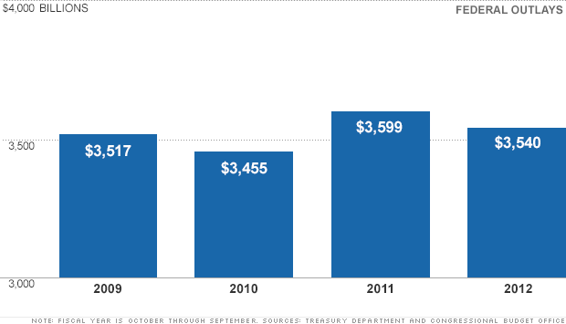
In the second example you can see that in the first graph, the numbers on the vertical axis don’t start at zero. There are indeed some differences between those zeven months but the differences are not as big as they seem in this graph. If the y-axis would have started at zero, you would have been able to see that more clearly. Instead of using the first graph, you should use the second graph where you can see the actual differences. However, it should be noted that it is not always bad to start the vertical axis somewhere above zero. You may have noticed that the vertical axis in the first example doesn’t start at zero either. However, in that case the differences in heights of the bars represent a large difference in the amount of money that the government has spent. If the axis would have started at zero, you would have believed the differences weren’t as big. So keep in mind what your graph is representing and what is the most adequate way of displaying your data.


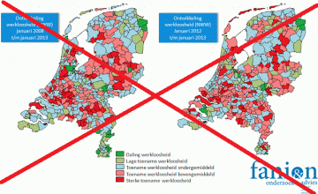
In the last example below you can see that the visualization on the left provides you with a lot of information. The first map in the first visualization shows you the unemployment rate in the Netherlands from the January 2008 until January 2013. The second map shows you the rate from January 2012 until January 2013. This visualization is supposed to show you how the unemployment rate has changed over the last five years in comparison to the last full year. However, in this display of the data it is very hard to extract the real meaning of this map. It is difficult to see the differences between those two maps. Instead of trying to display all this data at once, you should use a map that is more concise. In this case, it would be better if you just showed the second map, like shown in the second visualization. If you still would like to show the development over the past five years, it would be wiser to use a different kind of visualization.

Source
What are the key elements to a good visualization?
So what makes a visualization good? Cairo states that there are four features that define a good visualization. Your visualization should be functional, beautiful, insightful and enlightening. The shape of the graphic should match the questions that the visualization answers. The visualizations should also be attractive and insightful, so that readers will be eager to read your story. Besides that, the information displayed in the visualization should also shape the perception of the reader. According to Cairo, the three rules that you need to keep in mind in order to portray these features are as follows:
- Think about your audience and the publication.
- Think about the questions your visualization should answer
- You should be able to understand the visual without reading every number
In my opinion and as you have seen in the examples above, there are some other important and more concrete factors to pay attention to. You need to make sure that the numbers you show match with what you display in your graph. Moreover, pay attention to the y-axis and the x-axis and try to keep your visualization clear and concise. Don’t try to display too much information at once. And also, keep in mind what you want your visualization to represent. Like Cairo stated, it is important to think about the questions your visualization answers. That can mean that in some cases it is more logical to break a few rules in order to display your data in a more adequate way.
Conclusion
Visualizations can be a powerful and quiet useful addition to your story, provided that your visualization is correctly used. You have read above why it is important to use good visualizations. Furthermore, the examples above and the rules of Cairo have shown you what you need to think about before you create or use a certain visualization. Think about what you want to show and what message you are trying to deliver. And like always, be critical!

